Visualizing Ballots
We’ve just gone over reading and cleaning ballots from real-world voting records and generating ballots using a variety of models. In this section, we turn to visualizing ballots in a variety of ways.
Summary Statistics
VoteKit comes with some summary statistics built in for analyzing ballots. For this, we will introduce the Impartial Culture and Impartial Anonymous Culture models of ballot generation, which are frequently used in social choice scholarly literature, even though they are far less realistic and flexible than the models we ran in previous sections!
Impartial Culture (IC) is essentially the \(\alpha=\infty\) extreme of the family of Dirichlet measures from earlier; that is, the probability of each ranking is set exactly equal. Impartial Anonymous Culture (IAC) is the \(\alpha=1\) (“all bets are off”) case.
from votekit.plots import multi_profile_fpv_plot, profile_fpv_plot
import votekit.ballot_generator as bg

# generate a profile to work with first
candidates = ["A", "B", "C"]

# initializing the ballot generator
ic = bg.ImpartialCulture(candidates=candidates)
iac = bg.ImpartialAnonymousCulture(candidates=candidates)

profile1 = ic.generate_profile(number_of_ballots=1000)
profile2 = iac.generate_profile(number_of_ballots=1000)

print("IC profile:")
print(profile1.df)
print()
print("IAC profile:")
print(profile2.df)
IC profile:
             Ranking_1 Ranking_2 Ranking_3 Voter Set  Weight
Ballot Index
0                  (C)       (A)       (B)        {}   175.0
1                  (B)       (C)       (A)        {}   180.0
2                  (A)       (C)       (B)        {}   186.0
3                  (A)       (B)       (C)        {}   149.0
4                  (C)       (B)       (A)        {}   168.0
5                  (B)       (A)       (C)        {}   142.0

IAC profile:
             Ranking_1 Ranking_2 Ranking_3 Voter Set  Weight
Ballot Index
0                  (B)       (C)       (A)        {}   224.0
1                  (C)       (A)       (B)        {}   287.0
2                  (A)       (B)       (C)        {}   336.0
3                  (B)       (A)       (C)        {}   122.0
4                  (C)       (B)       (A)        {}    17.0
5                  (A)       (C)       (B)        {}    14.0
Now we’ll plot some summary statistics for the generated profiles.
first place voteswill measure how many first place votes each candidate received.bordareports the Borda score of each candidate. If there are \(n\) candidates on a ballot, the first place candidate gets \(n\) points, the second \(n-1\), and so on.mentionssimply counts the number of times candidates were listed at all. Note that if we use generative methods that produce complete rankings, everyone will necessarily have the same number of mentions!ballot lengthsis the distribution of ballot lengths in the profile. Again, if we use generative methods that produce complete rankings, every ballot will be the same length.
We can plot first place votes for one profile or for multiple profiles as follows.
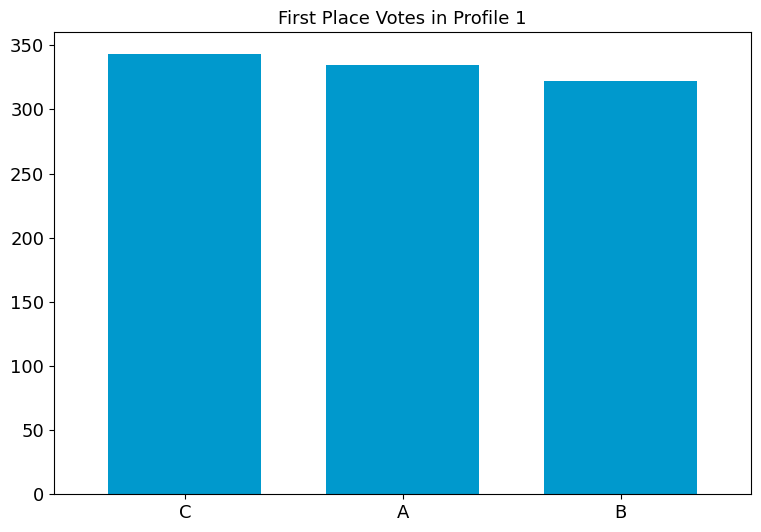
fig1 = profile_fpv_plot(profile1, title="First Place Votes in Profile 1")
fig2 = multi_profile_fpv_plot(
    {"Profile 1": profile1, "Profile 2": profile2},
    title="First Place Votes",
    show_profile_legend=True,
)
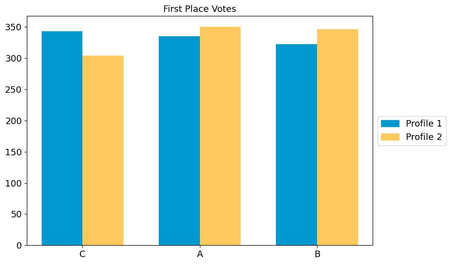
By default, the candidate ordering is determined by the first profile in
the dictionary, and is listed in decreasing order of first place votes.
We can override this with the parameter candidate_ordering.
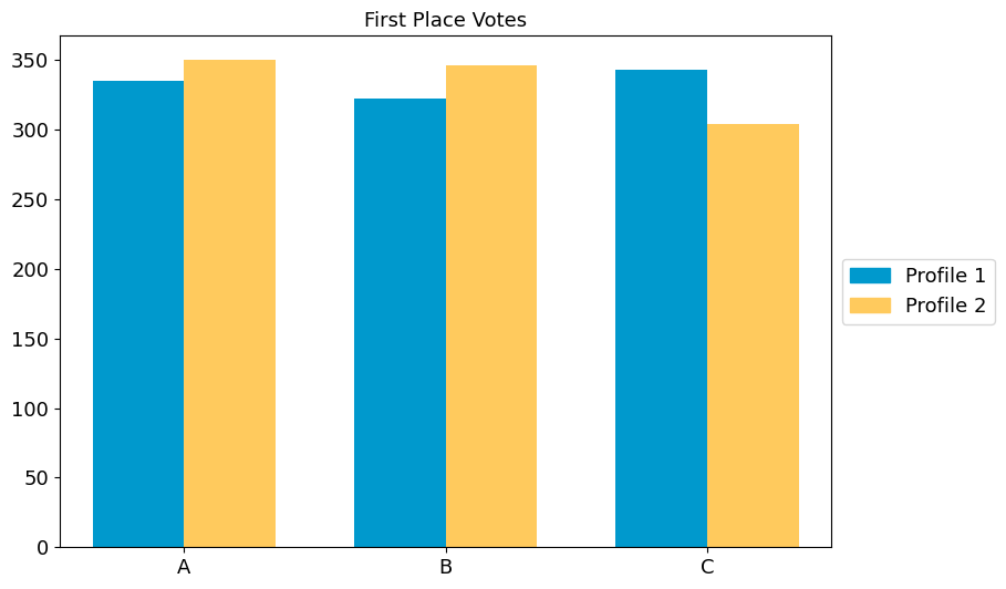
fig2 = multi_profile_fpv_plot(
    {"Profile 1": profile1, "Profile 2": profile2},
    title="First Place Votes",
    show_profile_legend=True,
    candidate_ordering=["A", "B", "C"],
)
Try it yourself
Use some of the other statistics available. Change the function from
profile_fpv_plottoprofile_borda_plotand toprofile_ballot_lengths_plot. Adapt the multi-profile plot accordingly. Change the title of the plot to reflect the stat.
Remember! Some generated profiles only have complete ballots.
from votekit.plots import (
    multi_profile_borda_plot,
    multi_profile_ballot_lengths_plot,
    profile_borda_plot,
    profile_ballot_lengths_plot,
)

# TODO add your code here
Pairwise Comparison Graph
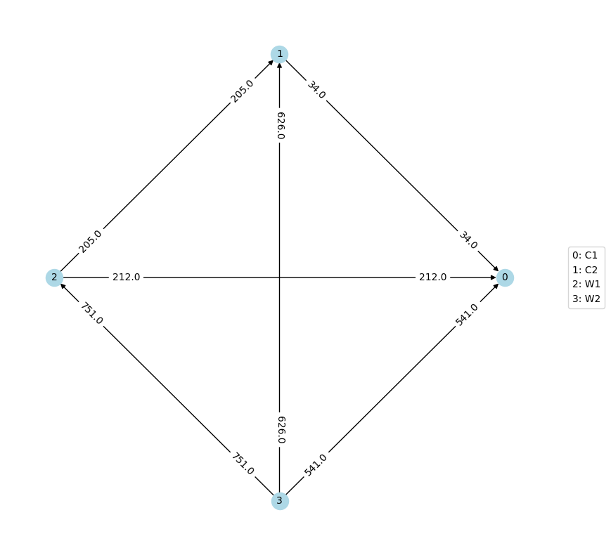
The pairwise comparison graph is used for examining head-to-head contests. Each vertex of the graph is a candidate. If there is an edge going from \(A\) to \(B\), that means \(A\) is preferred to \(B\) more times in the profile. The weight on the edge is the number of times \(A\) is preferred to \(B\) minus the number of times \(B\) is preferred to \(A\).
from votekit.graphs import PairwiseComparisonGraph

bloc_voter_prop = {"W": 0.8, "C": 0.2}

# the values of .9 indicate that these blocs are highly polarized;
# they prefer their own candidates much more than the opposing slate
cohesion_parameters = {"W": {"W": 0.9, "C": 0.1}, "C": {"C": 0.9, "W": 0.1}}

dirichlet_alphas = {"W": {"W": 2, "C": 1}, "C": {"W": 1, "C": 0.5}}

slate_to_candidates = {"W": ["W1", "W2"], "C": ["C1", "C2"]}

cs = bg.CambridgeSampler.from_params(
    slate_to_candidates=slate_to_candidates,
    bloc_voter_prop=bloc_voter_prop,
    cohesion_parameters=cohesion_parameters,
    alphas=dirichlet_alphas,
)

profile = cs.generate_profile(number_of_ballots=1000)
print(profile)

pwc_graph = PairwiseComparisonGraph(profile)
pwc_graph.draw()
Profile contains rankings: True
Maximum ranking length: 4
Profile contains scores: False
Candidates: ('C1', 'C2', 'W1', 'W2')
Candidates who received votes: ('W2', 'C2', 'C1', 'W1')
Total number of Ballot objects: 90
Total weight of Ballot objects: 1000.0
<Axes: >
Again, due to randomization, do not expect your graph labels to exactly match the one pictured in the tutorial.
The PairwiseComparisonGraph has methods for computing dominating
tiers and the existence of a Condorcet winner (one who beats every other
candidate head-to-head). A dominating tier is a group of candidates
that beats every lower-tier candidate in a head-to-head comparison.
# dominating tiers
print("tiers:", pwc_graph.get_dominating_tiers())

# condorcet winner
if pwc_graph.has_condorcet_winner() == True:
    print("The Condorcet candidate is:", pwc_graph.get_condorcet_winner())
else:
    print(
        "There is no Condorcet candidate.  The top tier is:",
        pwc_graph.get_dominating_tiers()[0],
    )
tiers: [{'W2'}, {'W1'}, {'C2'}, {'C1'}]
The Condorcet candidate is: W2
MDS Plots
One of the coolest features of VoteKit (in the humble opinion of this
tutorial author) is that we can create multidimensional scaling (MDS)
plots, using different notions of distance between
PreferenceProfiles. A multidimensional scaling plot (MDS) is a 2D
representation of high-dimensional data that attempts to minimize the
distortion of the data. VoteKit comes with two kinds of distance
metrics: earth-mover distance and \(L_p\) distance. You can read
about these in the VoteKit
documentation.
Let’s explore how an MDS plot can provide a powerful visualization. First we will initialize our generators.
from votekit.plots import plot_MDS, compute_MDS
from votekit.metrics import earth_mover_dist, lp_dist
from votekit import PreferenceInterval

number_of_ballots = 100

slate_to_candidates = {"all_voters": ["A", "B", "C"]}

prefs1 = {
    "all_voters": {"all_voters": PreferenceInterval({"A": 0.8, "B": 0.15, "C": 0.05})}
}
prefs2 = {
    "all_voters": {"all_voters": PreferenceInterval({"A": 0.1, "B": 0.5, "C": 0.4})}
}

bloc_voter_prop = {"all_voters": 1}
cohesion_parameters = {"all_voters": {"all_voters": 1}}

pl1 = bg.name_PlackettLuce(
    slate_to_candidates=slate_to_candidates,
    bloc_voter_prop=bloc_voter_prop,
    pref_intervals_by_bloc=prefs1,
    cohesion_parameters=cohesion_parameters,
)

pl2 = bg.name_PlackettLuce(
    slate_to_candidates=slate_to_candidates,
    bloc_voter_prop=bloc_voter_prop,
    pref_intervals_by_bloc=prefs2,
    cohesion_parameters=cohesion_parameters,
)

bt1 = bg.name_BradleyTerry(
    slate_to_candidates=slate_to_candidates,
    bloc_voter_prop=bloc_voter_prop,
    pref_intervals_by_bloc=prefs1,
    cohesion_parameters=cohesion_parameters,
)

bt2 = bg.name_BradleyTerry(
    slate_to_candidates=slate_to_candidates,
    bloc_voter_prop=bloc_voter_prop,
    pref_intervals_by_bloc=prefs2,
    cohesion_parameters=cohesion_parameters,
)
We have uncoupled the computation and plotting features since the computation is often time intensive, and this allows users to fiddle with the plot without recomputing the coordinates.
import matplotlib.pyplot as plt

# the data is a dictionary whose keys correspond to data labels
# and whose values are lists of PreferenceProfiles
coord_dict = compute_MDS(
    data={
        "pl1": [pl1.generate_profile(number_of_ballots) for i in range(10)],
        "pl2": [pl2.generate_profile(number_of_ballots) for i in range(10)],
        "bt1": [bt1.generate_profile(number_of_ballots) for i in range(10)],
        "bt2": [bt2.generate_profile(number_of_ballots) for i in range(10)],
    },
    distance=earth_mover_dist,
)


# we pass the computed coordinates, as well as a nested dictionary of plot parameters
# that will be passed to matplotlib scatter
ax = plot_MDS(
    coord_dict=coord_dict,
    plot_kwarg_dict={
        "pl1": {"c": "red", "s": 50, "marker": "x"},
        "pl2": {"c": "red", "s": 50, "marker": "o"},
        "bt1": {"c": "blue", "s": 50, "marker": "x"},
        "bt2": {"c": "blue", "s": 50, "marker": "o"},
    },
    legend=True,
    title=True,
)
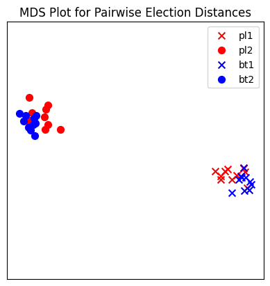
In this plot, each red mark represents a simulated election built from 1000 PL ballots, and each blue mark is likewise 1000 BT ballots, using the same preference interval. The marker, x or o, denotes the preference interval type. It’s very important to remember that the x axis and y axis numbers do not mean ANYTHING in an MDS plot—there’s literally a randomized algorithm throwing the 40 points into the plane in a manner that keeps similar things close and puts dissimilar things farther away. That is why our MDS function does not include any axis labels.
What is this plot telling us? The fact that x’s are in one area and o’s are in another tells us that the different preference intervals generate distinct profiles. Moreover, the fact that the red and blue models have little overlap shows that PL and BT are actually distinguishable as styles of ranking. This is encouraging!
Try it yourself
Increase the size of each profile to 1000 ballots instead of 10; then there’s more opportunity for the differences between PL and BT to emerge. Make the preference intervals more similar or more different; the picture will change accordingly.
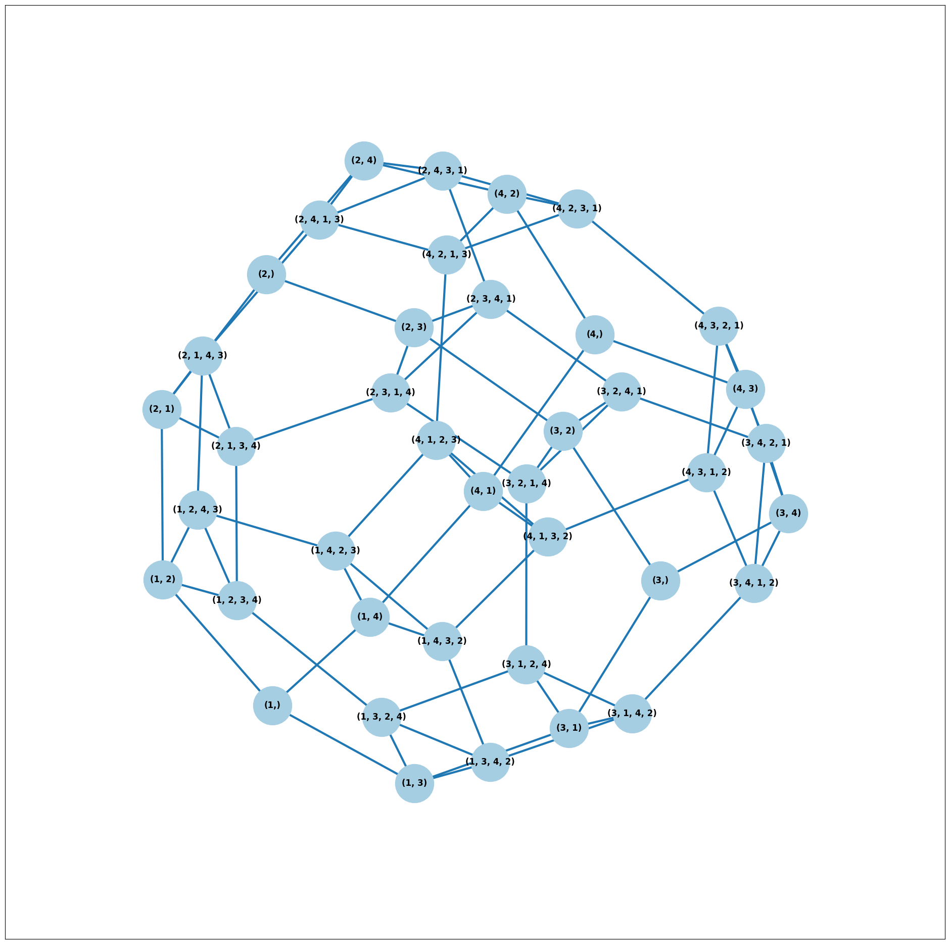
Ballot Graph
The last tool we want to introduce for analyzing ballots is the ballot graph. Each vertex of the ballot graph is a ballot (either a full linear ranking or a partial one). An edge goes between two ballots if they either differ by one candidate at the end of the ballot, or by swapping two adjacent candidates.
We can either initialize the ballot graph from a list of candidates, a
number of candidates, or a preference profile. Let’s start with a list
of candidates first. The allow_partial parameter tells the graph to
allow incomplete ballots, so when set to False it only shows the
\(n!\) permutations of the \(n\) candidates.
from votekit.graphs import BallotGraph
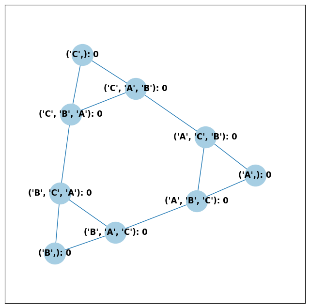
candidates = ["A", "B", "C"]
ballot_graph = BallotGraph(candidates, allow_partial=False)
ballot_graph.draw(labels=True)
ballot_graph = BallotGraph(candidates, allow_partial=True)
ballot_graph.draw(labels=True)
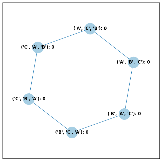
When we set labels=True, the ballot graph displays the candidate
names, as well as the number of votes cast on that ballot. Since this
graph was not constructed from a PreferenceProfile, the number of
votes is 0.
You might be wondering where any of the ballots of length 2 are. Currently, the ballot graph takes any ballot that lists all but one candidate and fills in the final candidate. (This might not be how you want it to behave, and we have plans to implement a version where the ballot \(A>B\) is distinct from \(A>B>C\).)
The BallotGraph class has a graph attribute which stores the
underlying networkx graph. The networkx graph is indexed by
integers; the method _number_cands returns a dictionary that
converts candidate names to these integers.
print("candidate dictionary:", ballot_graph._number_cands(cands=tuple(candidates)))
print()

for node, data in ballot_graph.graph.nodes(data=True):
    print("node", node)
    print(data)
    print()
candidate dictionary: {'A': 1, 'B': 2, 'C': 3}

node (1,)
{'weight': 0, 'cast': False}

node (1, 2, 3)
{'weight': 0, 'cast': False}

node (1, 3, 2)
{'weight': 0, 'cast': False}

node (2,)
{'weight': 0, 'cast': False}

node (2, 3, 1)
{'weight': 0, 'cast': False}

node (2, 1, 3)
{'weight': 0, 'cast': False}

node (3,)
{'weight': 0, 'cast': False}

node (3, 1, 2)
{'weight': 0, 'cast': False}

node (3, 2, 1)
{'weight': 0, 'cast': False}
The weight attribute would store the number of ballots (if the data came
from an election), and the cast attribute stores whether or not that
ballot appeared in the profile, i.e., returns True if the weight is
non-zero.
Now let’s generate a ballot graph from election data.
candidates = ["A", "B", "C"]

iac = bg.ImpartialAnonymousCulture(candidates=candidates)

profile = iac.generate_profile(number_of_ballots=1000)
print(profile)

ballot_graph = BallotGraph(profile)
ballot_graph.draw(labels=True, show_cast=False)

for node, data in ballot_graph.graph.nodes(data=True):
    print(node, data)
Profile contains rankings: True
Maximum ranking length: 3
Profile contains scores: False
Candidates: ('A', 'B', 'C')
Candidates who received votes: ('C', 'B', 'A')
Total number of Ballot objects: 6
Total weight of Ballot objects: 1000.0
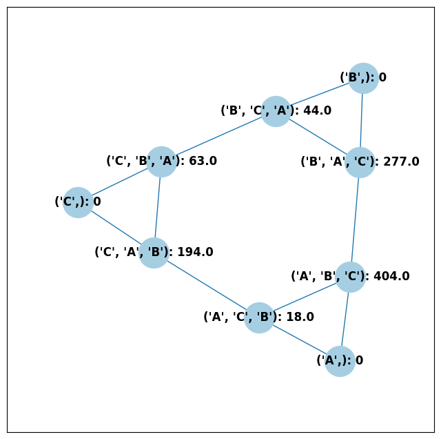
(1,) {'weight': 0, 'cast': False}
(1, 2, 3) {'weight': 404.0, 'cast': True}
(1, 3, 2) {'weight': 18.0, 'cast': True}
(2,) {'weight': 0, 'cast': False}
(2, 3, 1) {'weight': 44.0, 'cast': True}
(2, 1, 3) {'weight': 277.0, 'cast': True}
(3,) {'weight': 0, 'cast': False}
(3, 1, 2) {'weight': 194.0, 'cast': True}
(3, 2, 1) {'weight': 63.0, 'cast': True}
Check that this is reasonable: only ballots that were in the
PreferenceProfile should have cast = True, and their weight
attribute should correspond to the number of ballots cast. Why do none
of the bullet votes appear in the profile?
Try it yourself
If we wanted to visualize only the nodes corresponding to cast ballots, we use the
show_cast = Trueparameter in thedrawmethod. You can go back and try that above.
What if we wanted to explore a particular neighborhood of a ballot? Let’s look at the radius-1 neighborhood around the ballot (3,2,1,4). This is also called the 1-neighborhood, and it means (3,2,1,4) and its immediate neighbors, with their interconnections shown. The 0-neighborhood is only a point itself; the 2-neighborhood is everything within two steps on the ballot graph.
Here we will initialize the ballot graph from a number, representing the number of candidates. The scale parameter allows us to better visualize the crowded graph.
ballot_graph = BallotGraph(4)
ballot_graph.draw(scale=3)

# the neighborhoods parameter takes a list of tuples (node, radius)
# and displays the corresponding neighborhoods
ballot_graph.draw(neighborhoods=[((3, 2, 1, 4), 1)])
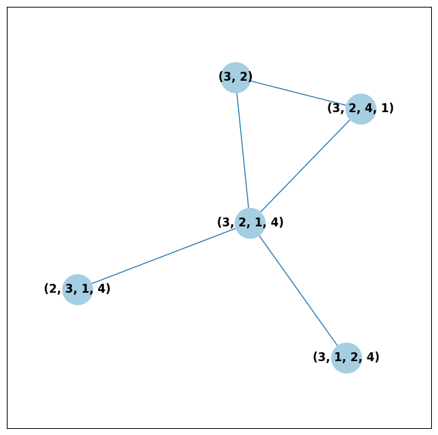
We can also draw multiple neighborhoods.
Try it yourself
In addition to the 1-neighborhood of (3,2,1,4), draw the 1-neighborhood of (2,). Note that you have to write (2,) and not simply (2) to designate the node with a bullet vote for candidate 2.
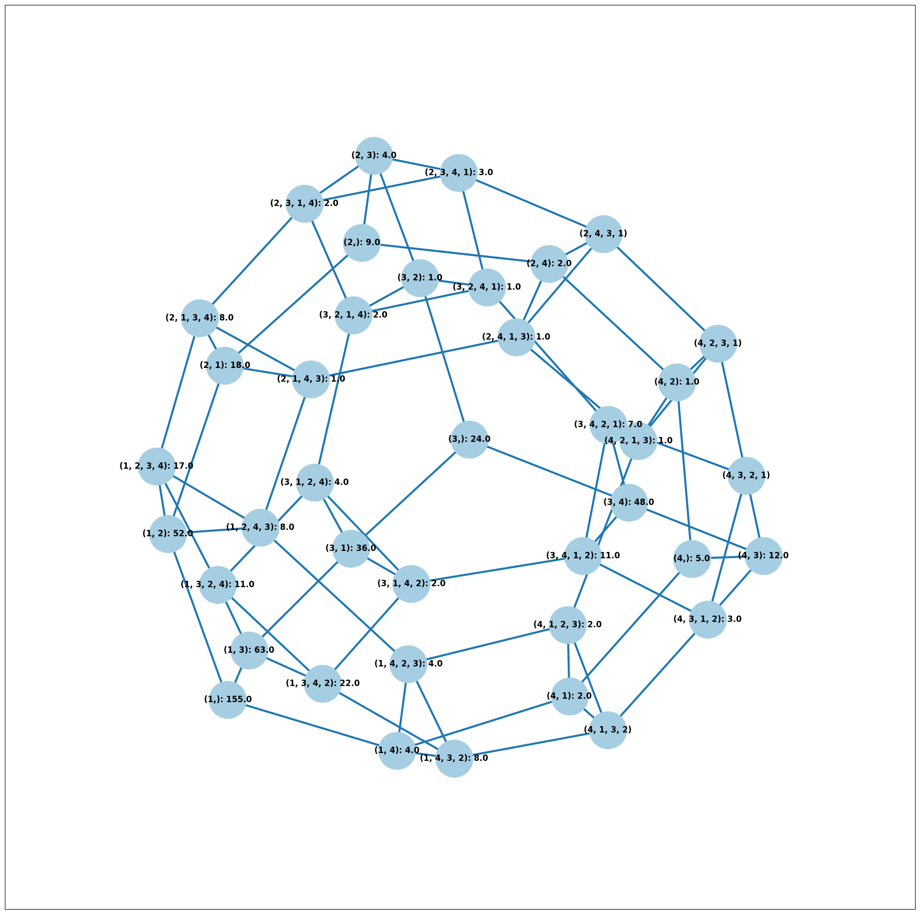
Scottish Elections
Scottish elections give us a great source for real-world ranked data, because STV is used for local government elections. Thanks to David McCune of William Jewell College, we have a fantastic repository of shiny, clean ranking data from over 1000 elections, which feature 3-14 candidates apiece, running with a party label.
Here we load in the CVR from a ward in Comhairle nan Eilean Siar in 2012, in the election for city council. Please download the csv file here and place it in your working directory (the same folder as your code).
from votekit.cvr_loaders import load_scottish
from votekit.graphs import BallotGraph

# the load_scottish function returns a tuple of information:
# the first element is the profile itself, the second is the number of seats in the election
# the third is a list of candidates, the fourth a dictionary mapping candidates to parties,
# and the fourth the ward name
scottish_profile, seats, cand_list, cand_to_party, ward = load_scottish(
    "eilean_siar_2012_ward3.csv"
)


# we don't want to alter any ballots so we'll turn off "fix_short"
ballot_graph = BallotGraph(scottish_profile, fix_short=False)

print(scottish_profile)


# only show us the ballots cast
ballot_graph.draw(show_cast=False, labels=False, scale=3)
Profile contains rankings: True
Maximum ranking length: 4
Profile contains scores: False
Candidates: ('Catherine Macdonald', 'D J Macrae', 'Philip Robert Mclean', 'David Cameron Wilson')
Candidates who received votes: ('Catherine Macdonald', 'Philip Robert Mclean', 'D J Macrae', 'David Cameron Wilson')
Total number of Ballot objects: 57
Total weight of Ballot objects: 802.0

The candidates are labeled as follows.
1 Catherine Macdonald
2 D J Macrae
3 Philip Robert Mclean
4 David Cameron Wilson
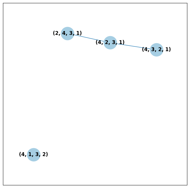
There are 64 possible ballots in an election with 4 candidates (65 if
you count the empty ballot). How many of those ballots types are missing
in this example? Let’s figure out which ones. VoteKit allows you to
create custom display functions for the ballot graph. These functions
must take a networkx graph and node as input and return True if
you want to display the node.
def show_zero(graph, node):
    # display nodes with no votes
    if graph.nodes[node]["weight"] == 0:
        return True
    return False


print("Displaying missing ballots:")
ballot_graph.draw(labels=False, to_display=show_zero)
Displaying missing ballots:
The candidates are labeled as follows.
1 Catherine Macdonald
2 D J Macrae
3 Philip Robert Mclean
4 David Cameron Wilson
Further Prompts
Generate profiles on three candidates in a manner that is reasonably likely to result in a Condorcet cycle, in which there is no Condorcet winner because the arrows go around in, well, a cycle.
Make MDS plots that include
ImpartialCultureandCambridgeSamplersimulations in addition to PL and BT.We have also implemented
lp_distas an alternative toearth_mover_dist. The \(L_p\) distance is parameterized by \(p\in (0, \infty]\). It defaults to \(p=1\). If we want another value for \(p\) we will need to use thepartialfunction from thefunctoolsmodule. (If you want \(p=\infty\), typep_value="inf".)
from functools import partial

# this code is what you would give to the distance parameter
# if you wanted something other than p=1
distance = partial(lp_dist, p_value=47)
Generate a ballot graph from a
PreferenceProfileso we can see how these attributes change. Create a profile with 3 candidates using theImpartialCulturemodel. To create the ballot graph from a profile, simply pass it in asBallotGraph(profile). Print your profile, display the ballot graph, and print out the data of each node. Confirm that these all match!Write a custom display function for a ballot graph to display ballots that have more than 30 votes.